
Part II
3.
How
How did we build
So, how did we actually go about building all this? Here’s a look behind the scenes at what shaped the product — from research to visual identity and the ripple effects after launch.
User research
Identity
Design System
Impact after launch
User feedback

The Process
🔍
35+ user interviews over Zoom with therapists, practice managers, and billing specialists to uncover their biggest pain points.
📼
100+ hours of recorded sessions and meetings analyzed to understand real-world workflows and challenges.
🗺
Mapped 15+ existing tools and processes, identifying inefficiencies, redundancies, and gaps in practice management.
Demography
🧑💼
Age & Experience
55%
28-40 years old, Early to mid-career professionals, balancing clinical work with growing their practice.
35%
40-50 years old, Established providers running solo or small group practices.
10%
50+ years old, Senior therapists transitioning from traditional systems to modern digital solutions.
📍
Location
80%
United States (California, New York, Texas)
15%
15%: Canada and Australia (English-speaking regions with similar practice models)
5%
Other international users
🏥
Practice size
45%
Solo Practitioners (60%): Independent therapists managing their own clients and operations.
35%
Small to Mid-Sized Group Practices (35%): Teams of 2-20 providers requiring collaboration and billing support.
20%
Large Clinics, Multi-location practices with complex administrative needs.
💻
Tech proficiency
60%
Moderate, Familiar with digital platforms but prefer simple, intuitive interfaces.
20%
High,Tech-savvy therapists, comfortable with digital tools, looking for efficiency.
20%
Low, Struggling with complex software, previously using paper-based or outdated systems.
Our research helped us identify a consistent user profile. Most users are individual therapists between their late 20s and early 40s, typically working independently or within small group practices. The majority are based in the United States, with notable representation in states like California, New York, and Texas.
While they are generally comfortable using technology, their primary focus is on client care — not navigating complex software. This highlighted the importance of building tools that are intuitive, reliable, and easy to integrate into their daily workflow.
Persona wall
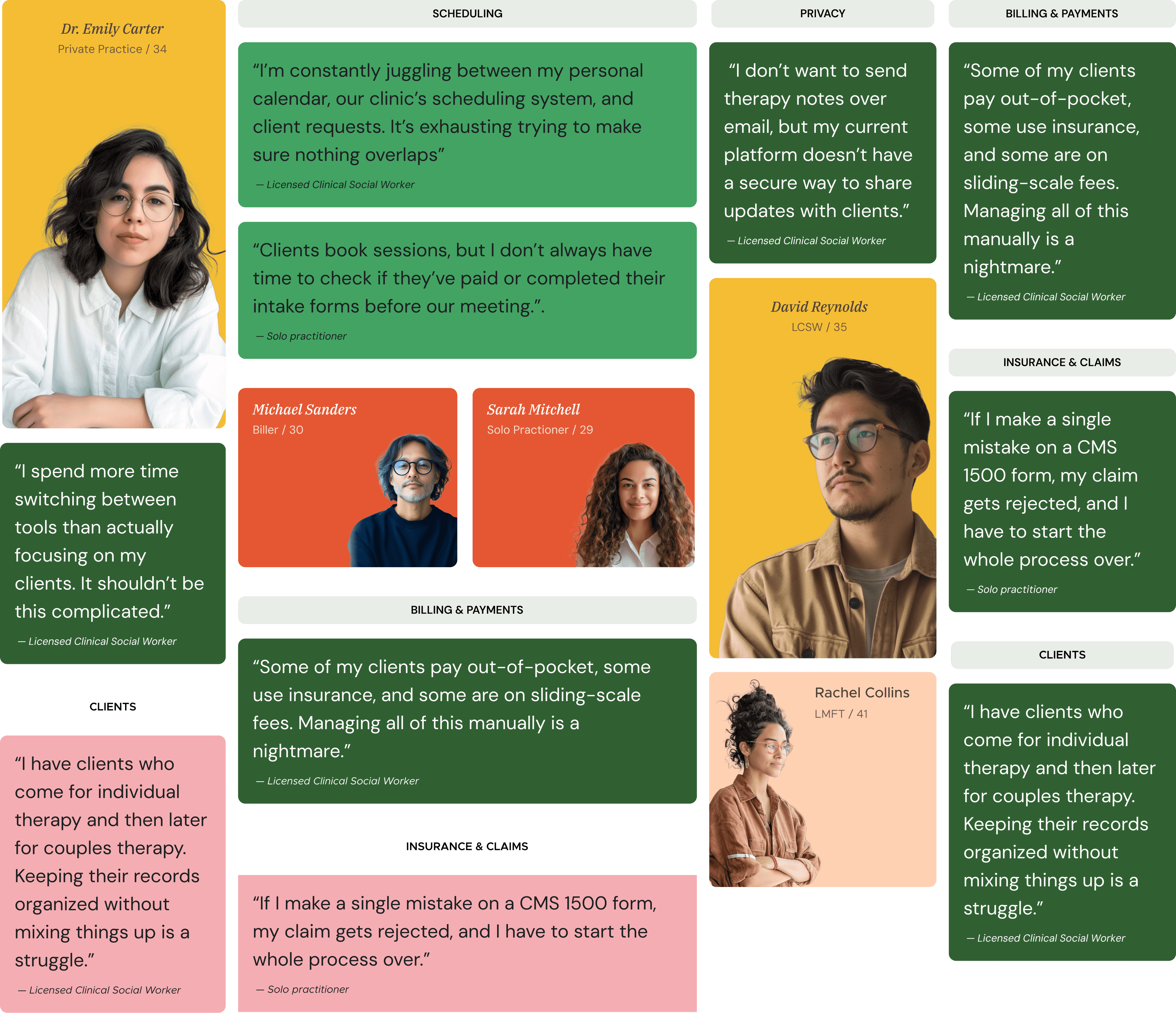
Ground Reality & Insights
User research gave us what planning alone couldn’t: a clear view into the day-to-day realities of our users. What initially appeared simple often turned out to be more layered and context-dependent.
For example, we assumed that most therapists would operate within a single practice or platform. In reality, many providers divide their time across multiple settings — including private practices, hospitals, and telehealth platforms. As one therapist shared:
“I see clients in two practices and do supervision in a third. My calendar is a mix of everything.”
This made it clear that availability tracking and scheduling needed to support multiple contexts, not just a single system.
We also saw that responsibilities within a practice can vary significantly. While some therapists focus solely on client sessions, others take on administrative work, supervise peers, or assist with billing. Many practices also employ dedicated non-clinical staff for roles like client onboarding and invoice management. Rigid role definitions didn’t reflect how work actually happens.
“Sometimes I wear three hats — therapist, admin, and clinical supervisor. It really depends on the day.”
This led us to rethink how permissions, visibility, and user roles should function — shifting from fixed templates to more flexible configurations that can support blended responsibilities.
Billing workflows also surfaced as a key area of friction. Many therapists mentioned needing to double-check insurance codes, correct errors, and switch between different tools just to complete billing tasks.
“The systems don’t talk to each other. I have to cross-reference so much, it slows down everything.”
These insights helped us better understand how workflows differ based on context, team structure, and individual preferences. Instead of building for a theoretical “standard flow,” we learned the importance of designing for the practical variations that show up in real-world use.
Identity

To design something that feels authentic, we first had to define the personality behind it. By defining a clear set of traits, we could make design decisions that felt intentional and true to the product’s purpose.
🌱
Growth
We designed Omnipractice to not just support, but nurture mental health professionals and their clients, enabling them to thrive. From career growth for providers to personal progress for clients, every design decision fosters a path toward continuous development.
⚡
Modern
We wanted Omnipractice to feel fresh and contemporary, moving away from the outdated, clunky interfaces common in the industry. Every interaction was crafted to be seamless, efficient, and visually engaging.
Design system
To make the product feel cohesive from the start, we built a design system early in the process. It helped us stay consistent, move faster, and maintain clarity across teams as the product grew.
What we built
Our system included all the foundational components: buttons, inputs, modals, and layout grids — in multiple sizes and states. It also covered tokens for spacing, typography, and color, making handoff to development easier and more reliable.
How it helped
Allowed us to move faster during later stages of design.
Reduced back-and-forth with developers on spacing and style decisions.
Gave us a shared language across design and engineering.
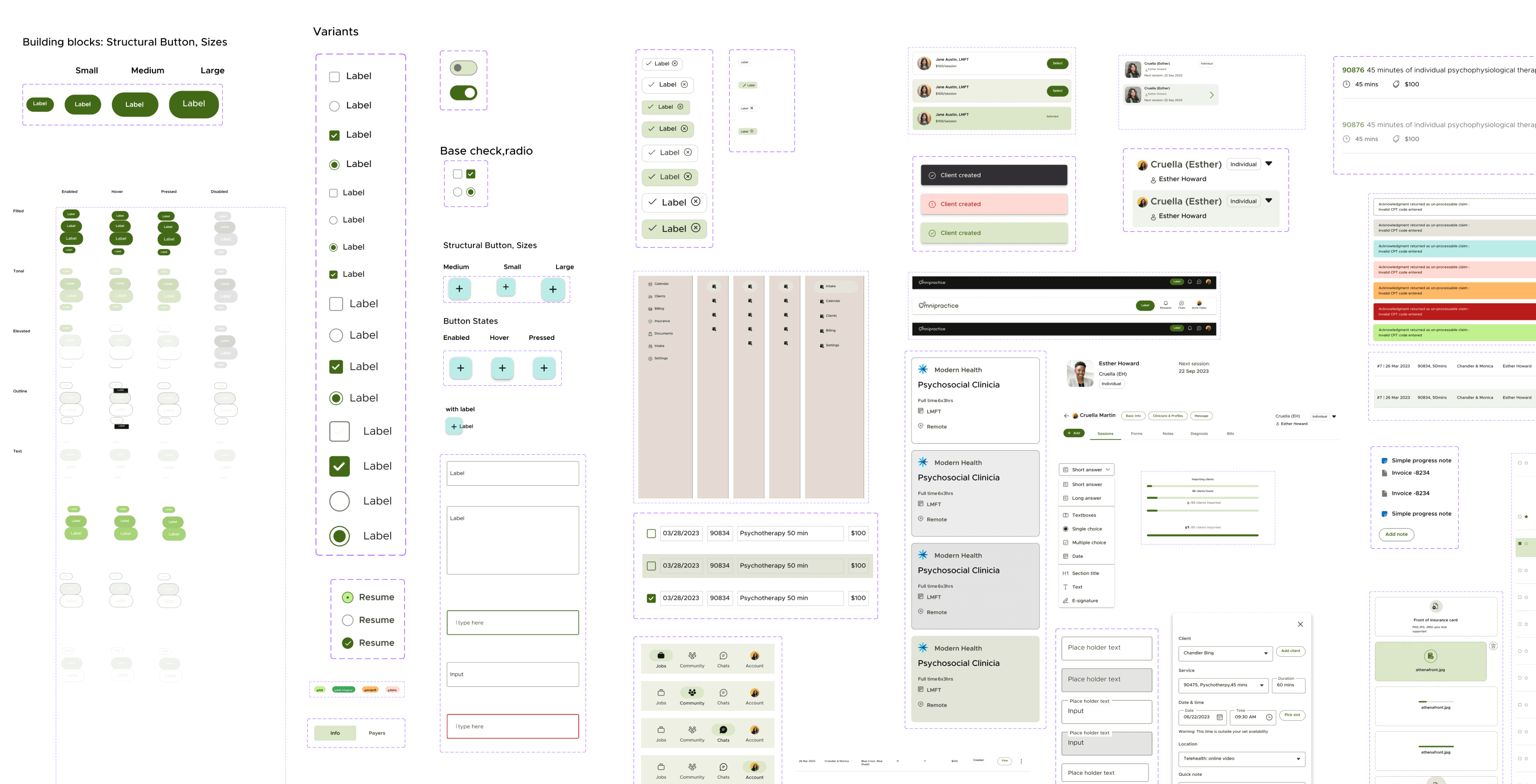
Design System snapshot - Overview

Design System - Components & Assets

Design System - Button component
Impact
It wasn’t just the numbers that stood out—it was what people said. For the first time, providers felt in control instead of overwhelmed.
“

Jessica Tran, LMFT, Practice Owner
After soft launch
10+
Business Clients
500+
Users
Designing Omnipractice taught me that the best solutions come from listening deeply and iterating often. This project wasn’t always easy, but every challenge helped shape a better product—and made me a stronger designer.
it was a lesson in empathy, collaboration, and strategic problem-solving. Leading the product from the ground up gave me the opportunity to balance user needs, business goals, and technical constraints at every step.
Fin